作者:万少
前言
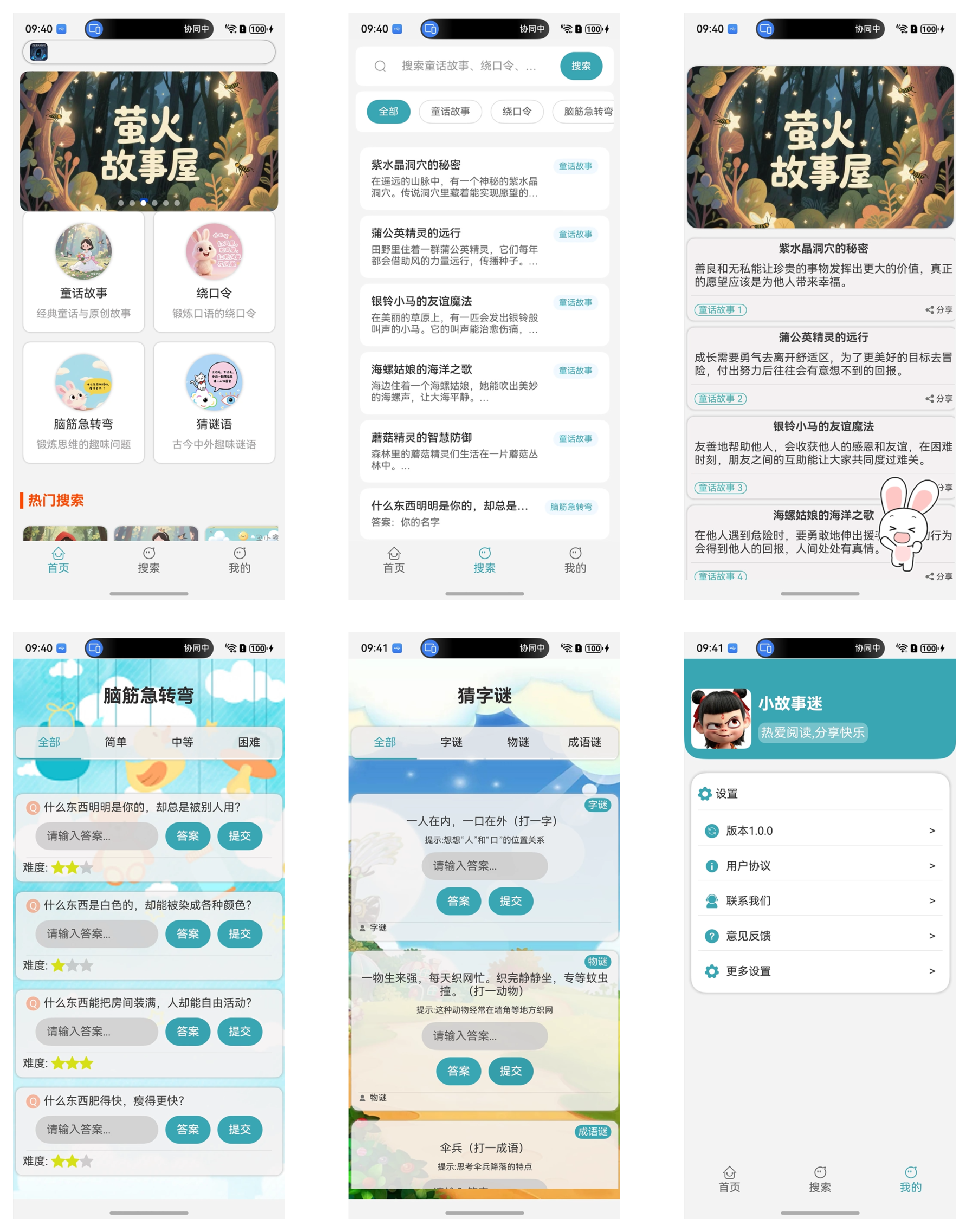
青蓝萤火故事屋 是已经上架到HarmonyOS应用市场的鸿蒙应用,它支持HarmonyOS 5+设备访问使用,也就是俗称的纯血鸿蒙。
界面一览如下。
Swiper介绍
Swiper组件提供滑动轮播显示的能力。Swiper本身是一个容器组件,当设置了多个子组件后,可以对这些子组件进行轮播显示。通常,在一些应用首页显示推荐的内容时,需要用到轮播显示的能力。

其中系统也提供了基础、系统的Swiper属性,如下表所示。
基础功能属性
| 属性 | 类型 | 默认值 | 描述 | 使用场景 |
|---|---|---|---|---|
| index | number | 0 | 当前显示的子组件索引 | 控制初始显示页面或跳转到指定页面 |
| loop | boolean | true | 是否循环播放 | 需要无限轮播时开启 |
| autoplay | boolean | false | 是否自动轮播 | 需要自动切换内容时 |
| interval | number | 3000 | 自动轮播间隔(毫秒) | 控制自动播放速度 |
| duration | number | 400 | 滑动动画时长(毫秒) | 调整切换动画的流畅度 |
| vertical | boolean | false | 是否为纵向滑动 | 实现垂直方向的轮播 |
显示控制属性
| 属性 | 类型 | 默认值 | 描述 | 使用场景 |
|---|---|---|---|---|
| displayCount | number | 1 | 每页显示的子组件数量 | 实现多卡片并排显示 |
| itemSpace | number | 0 | 子组件之间的间距 | 调整卡片间的距离 |
| prevMargin | number/string | 0 | 前边距,露出前一项部分内容 | 实现"预览"效果 |
| nextMargin | number/string | 0 | 后边距,露出后一项部分内容 | 实现"预览"效果 |
| cachedCount | number | -1 | 预加载的子组件数量 | 优化性能,减少滑动卡顿 |
导航指示器属性
| 属性 | 类型 | 默认值 | 描述 | 使用场景 |
|---|---|---|---|---|
| indicator | boolean | true | 是否显示导航点指示器 | 基本的页码指示 |
| indicatorStyle | Object | - | 自定义指示器样式 | 个性化导航点外观 |
| digital | boolean | false | 是否启用数字导航点 | 需要显示具体页码时 |
| displayArrow | boolean | false | 是否显示导航箭头 | 需要明确的切换指引 |
交互控制属性
| 属性 | 类型 | 默认值 | 描述 | 使用场景 |
|---|---|---|---|---|
| disableSwipe | boolean | false | 是否禁止用户滑动操作 | 只允许程序控制切换 |
| disableTouch | boolean | false | 是否禁止触摸操作 | 完全禁用用户交互 |
| nestedScroll | Object | - | 嵌套滚动模式配置 | 处理内外滚动冲突 |
动画效果属性
| 属性 | 类型 | 默认值 | 描述 | 使用场景 |
|---|---|---|---|---|
| curve | Curve | Linear | 动画曲线 | 控制切换动画的缓动效果 |
| scrollEffect | string | "spring" | 滑动边缘效果 | 设置滑动到边缘的回弹效果 |
| customContentTransition | function | - | 自定义切换动画 | 实现复杂的过渡动画 |
然而
但是在实际开发中,往往需要我们根据业务的需求,需要对Swiper进行基本的定制或者简化它的使用步骤,比如以下需求。
- ✅ 自动播放功能,可配置播放间隔
- ✅ 多种指示点位置选择(顶部/底部,左/中/右)
- ✅ 手势滑动支持,触摸时自动暂停播放
- ✅ 响应式设计,自动适应不同屏幕尺寸
- ✅ 支持图片标题和描述显示
- ✅ 渐变遮罩效果
- ✅ 循环播放支持
- ✅ 优雅的动画过渡效果
- ✅ 空状态处理
第三方的Swiper组件
Swiper 轮播组件 是一个第三方的Swiper组件,它支持HarmonyOS 5系统,API版本16以及以上,V1状态管理器,并且针对常见的Swiper使用需求进行了封装,比如:
- ✅ 自动播放功能,可配置播放间隔
- ✅ 多种指示点位置选择(顶部/底部,左/中/右)
- ✅ 手势滑动支持,触摸时自动暂停播放
- ✅ 响应式设计,自动适应不同屏幕尺寸
- ✅ 支持图片标题和描述显示
- ✅ 渐变遮罩效果
- ✅ 循环播放支持
- ✅ 优雅的动画过渡效果
- ✅ 空状态处理
使用步骤
1. 下载Har
Swiper轮播组件没有上架到三方市场,所以需要我们下载它Har包的形式使用。
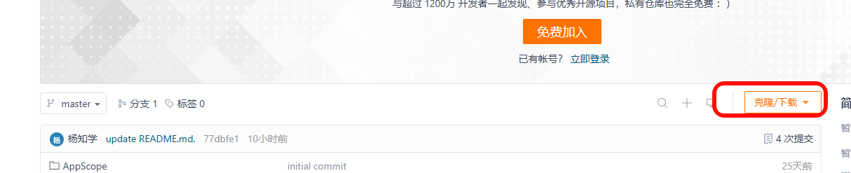
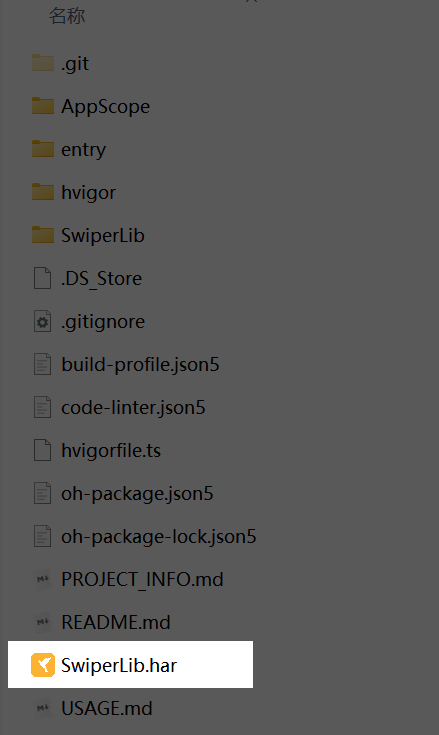
然后得到本地文件 SwiperLib.har ,如图所示。
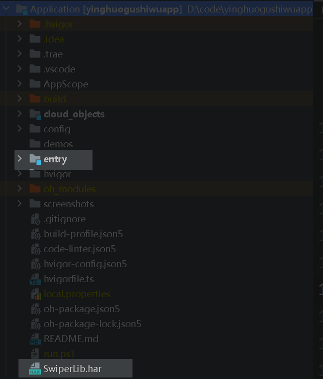
2. 拷贝SwiperLib.har 到自己的工程目录中
因为并没有上传到三方库中,所以需要自己拷贝到工程中,如图所示。
3. 工程中引入
然后在自己工程都模块中来引入它
entry/oh-package.json5
{
  "name": "entry",
  "version": "1.0.0",
  "description": "Please describe the basic information.",
  "main": "",
  "author": "",
  "license": "",
  "dependencies": {
    "@hzw/zrouter": "^1.6.0",
    "swiperlib": "file:../SwiperLib.har"
  },
  "devDependencies": {},
  "dynamicDependencies": {}
}
4. 然后在页面中直接使用即可
1. 引入相关模块
import { IndicatorPosition, SwiperComponent, SwiperItem } from 'swiperlib';
2. 初始化数据
需要注意的时,该组件目前只支持网络图片,还不支持本地图片😒,如果要用到网络图片,需要在modules.json5文件中声明网络权限
@State private swiperData: SwiperItem[] = [
    {
      id: `swiper_${Date.now()}_1`,
      imageUrl: "https://wsy996.obs.cn-east-3.myhuaweicloud.com:443/tmp/home_banner1.png?x-image-process=style/style-ys",
      title: "标题1"
    }, {
    id: `swiper_${Date.now()}_2`,
    imageUrl: "https://wsy996.obs.cn-east-3.myhuaweicloud.com:443/tmp/home_banner2.png?x-image-process=style/style-ys",
    title: "标题2"
  }, {
    id: `swiper_${Date.now()}_3`,
    imageUrl: "https://wsy996.obs.cn-east-3.myhuaweicloud.com:443/tmp/home_banner3.png?x-image-process=style/style-ys",
    title: "标题3"
  }, {
    id: `swiper_${Date.now()}_4`,
    imageUrl: "https://wsy996.obs.cn-east-3.myhuaweicloud.com:443/tmp/home_banner4.png?x-image-process=style/style-ys",
    title: "标题4"
  }, {
    id: `swiper_${Date.now()}_5`,
    imageUrl: "https://wsy996.obs.cn-east-3.myhuaweicloud.com:443/tmp/home_banner5.png?x-image-process=style/style-ys",
    title: "标题5"
  },

  ];
3. 渲染
  SwiperComponent({
    dataSource: this.swiperData,
    autoPlay: true,
    autoPlayInterval: 3000,
    componentHeight: "200vp",
    showIndicator: true,
    indicatorPosition: IndicatorPosition.BOTTOM_CENTER
  })
4. 效果

5. 完整示例代码
import { IndicatorPosition, SwiperComponent, SwiperItem } from 'swiperlib';

@Component
@Entry
struct Index {
  @State private swiperData: SwiperItem[] = [
    {
      id: `swiper_${Date.now()}_1`,
      imageUrl: "https://wsy996.obs.cn-east-3.myhuaweicloud.com:443/tmp/home_banner1.png?x-image-process=style/style-ys",
      title: "标题1"
    }, {
    id: `swiper_${Date.now()}_2`,
    imageUrl: "https://wsy996.obs.cn-east-3.myhuaweicloud.com:443/tmp/home_banner2.png?x-image-process=style/style-ys",
    title: "标题2"
  }, {
    id: `swiper_${Date.now()}_3`,
    imageUrl: "https://wsy996.obs.cn-east-3.myhuaweicloud.com:443/tmp/home_banner3.png?x-image-process=style/style-ys",
    title: "标题3"
  }, {
    id: `swiper_${Date.now()}_4`,
    imageUrl: "https://wsy996.obs.cn-east-3.myhuaweicloud.com:443/tmp/home_banner4.png?x-image-process=style/style-ys",
    title: "标题4"
  }, {
    id: `swiper_${Date.now()}_5`,
    imageUrl: "https://wsy996.obs.cn-east-3.myhuaweicloud.com:443/tmp/home_banner5.png?x-image-process=style/style-ys",
    title: "标题5"
  },

  ];

  build() {
    Column() {
      SwiperComponent({
        dataSource: this.swiperData,
        autoPlay: true,
        autoPlayInterval: 3000,
        componentHeight: "200vp",
        showIndicator: true,
        indicatorPosition: IndicatorPosition.BOTTOM_CENTER
      })
    }
    .width("100%")
    .height("100%")
    .justifyContent(FlexAlign.Center)
  }
}
其他功能
基础轮播
SwiperComponent({
  dataSource: swiperData,
  autoPlay: true,
  autoPlayInterval: 3000,
  showIndicator: true,
  indicatorPosition: IndicatorPosition.BOTTOM_CENTER
})
自定义样式
SwiperComponent({
  dataSource: swiperData,
  componentHeight: "150vp",
  componentWidth: "80%",
  componentBorderRadius: "16vp",
  componentMargin: "20vp"
})
禁用自动播放
SwiperComponent({
  dataSource: swiperData,
  autoPlay: false,
  showIndicator: true
})
顶部指示点
SwiperComponent({
  dataSource: swiperData,
  indicatorPosition: IndicatorPosition.TOP_RIGHT
})
最佳实践
1. 数据源管理
@State private swiperData: SwiperItem[] = [];

// 推荐:使用唯一ID
private loadSwiperData() {
  this.swiperData = [
    {
      id: `swiper_${Date.now()}_1`,
      imageUrl: "https://example.com/image1.jpg",
      title: "标题1"
    }
  ];
}
2. 性能优化
// 推荐:合理设置自动播放间隔
SwiperComponent({
  autoPlayInterval: 4000, // 不要设置过短的间隔
  loop: true // 启用循环播放提升用户体验
})
3. 响应式设计
// 推荐:使用相对单位
SwiperComponent({
  componentHeight: "30%", // 相对于父容器
  componentWidth: "100%"
})
4. 错误处理
// 推荐:提供默认图片
let swiperData: SwiperItem[] = data.map((item, index) => ({
  id: item.id || `default_${index}`,
  imageUrl: item.imageUrl || "/common/images/default.png",
  title: item.title || "默认标题",
  description: item.description
}));
注意事项
- 图片资源:确保图片URL有效,建议提供备用图片
- 数据唯一性:每个SwiperItem需要唯一的id
- 性能考虑:避免同时加载过多大尺寸图片
- 内存管理:组件会自动管理定时器生命周期
- 触摸交互:用户触摸时会暂停自动播放
留言讨论
正在加载评论…